Adding a Callout in the Wowchemy theme
 Custom Callout
“Callout” refers to the practice of creating blocks of text in a blog post to emphasize specific phrases or statements. In Wowchemy, the Callout feature supports only two types: “note” and “warning.”
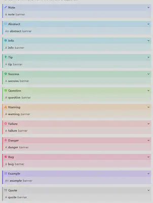
Here are the Callouts supported by Wowchemy
It is indeed disappointing that Wowchemy supports only two types of Callouts.
The image you provided shows the “admonition” feature, which is similar to Callouts and is used in the Doit theme. Admonitions support 12 different types and also offer the ability to collapse or expand them.
일단 Wowchemy에서 비슷한 시도가 있는지 검색해보았습니다. 이 이슈를 읽어보면 Custom으로 추가가 가능하다고 합니다. 하지만 Custom은 Hugo 테마라면 대부분 되는것이기 때문에 큰 장점은 아닙니다.
I searched for similar attempts in Wowchemy, and found this issue where it states that custom additions are possible. However, since most Hugo themes support customization, it is not a significant advantage.
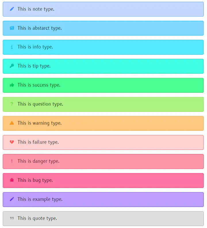
I added custom callouts following the Doit theme, with a total of 12 additions. There are three main elements in the callouts: border, background, and icon.
First, I defined a base color and used it to define four additional colors.
- border-color: The border color is the same as the base color.
- icon-color: The icon color is the same as the base color.
- (light) background-color: In the light theme, the background color is 25% brighter than the base color.
- (dark) background-color: In the dark theme, the background color is 25% darker than the base color.
Additionally, I made sure that each callout can have a different icon applied to it.
Finally, I added the following code to assets/scss/custom.scss.
$callout-icon: (
  'note-admon': '\f304',
  'abstract': '\f1ea',
  'info': '\f129',
  'tip': '\f084',
  'success': '\f164',
  'question': '\f128',
  'warning-admon': '\f071',
  'failure': '\f7a9',
  'danger': '\f12a',
  'bug': '\f188',
  'example': '\f0d0',
  'quote': '\f10e',
);

$callout-color-map: (
  'note-admon': #448aff,
  'abstract': #00b0ff,
  'info': #00b8d4,
  'tip': #00bfa5,
  'success': #00c853,
  'question': #64dd17,
  'warning-admon': #ff9100,
  'failure': #ff5252,
  'danger': #ff1744,
  'bug': #f50057,
  'example': #651fff,
  'quote': #9e9e9e,
);

@each $key, $color in $callout-color-map {
  .alert-#{$key} {
    font-size: 0.9rem;
    border-color: $color;
    background-color: adjust-color($color, $lightness: 25%);
  }

  .dark .alert-#{$key} {
    color: #FFFFFF;
    background-color: adjust-color($color, $lightness: -25%);
  }

  div.alert-#{$key} > div:first-child::before {
    font-size: 0.9rem;
    top: 0.0rem;
    color: $color;
  }
}

@each $key, $icon in $callout-icon {
  div.alert-#{$key} > div:first-child::before {
    content: $icon;
  }
}
After the additions, the callouts look like the following.
I’m satisfied with the progress so far, but I still feel a bit unsatisfied. However, due to limited knowledge in HTML and CSS, I’ve reached a limit in creating more. I plan to leave the following tasks as to-dos and summarize:
- Create a separate shortcode instead of using callouts.
- Implement an expand/collapse feature.
- Add a title functionality.
- Modify the border to only appear on the left side.
- Distribute the shortcode.